Retention is King: How to Balance Your Unit Economics
We break down what retention actually is, how to measure it, and why it’s the only way to align your $140 CAC with your $30 LTV.

Introduction: The Math That Doesn’t Forgive
The dating industry has fundamentally changed. The era of “growth at all costs” is dead and buried. As I mentioned in my previous post, Paid Ads Are Suicide, trying to solve your growth problems by simply throwing money at them is now a death sentence for startups.

Let’s look at the brutal reality of the numbers. I’ve run these calculations hundreds of times across products like Seeking, Dil Mil, and now with SkaDate clients.
In the US market, the Cost Per Action (CPA) for a single registration via Meta (Facebook/Instagram) or TikTok currently hovers between $5 and $10.
But here is the catch: a registration is not money in the bank. In the mass dating market, the average conversion rate from a free user to a paid subscriber is roughly 5% (and for brand new products without liquidity, it’s often much lower).
Let’s do the math:
To get 1 paying client, you need to acquire 20 free registrations (at a 5% conversion rate).
If you pay $7 per registration, your real Customer Acquisition Cost (CAC) is $140 ($7 × 20).
Now, look at your revenue. The average monthly subscription price in mass dating is $30–$40.
The math is cruel: You are spending $140 to earn $30.
You are losing $110 on every single customer you acquire. This model is fundamentally broken if the user only pays once.
The only way to survive in this new era of efficiency is Retention. If you cannot keep a user active and paying for months, your unit economics will never balance.
Chapter 1: What is Retention, Really?
Many founders have a simplistic view of retention. They ask, “Did the user open the app again?” But in the dating industry, that definition is too shallow.
Retention is a measure of the value a user gets from your product over time.
If a user opens your app, stares at a blank screen, doesn’t like anyone, and sends no messages, that is not retention. That is “Zombie Traffic.” True retention isn’t built on “App Opens”; it is built on performing a Core Action. In dating, that Core Action is a conversation.
The “Leaky Bucket” Economy
Think of your product as a bucket. Marketing is the hose pouring water (users) into it. Retention is the structural integrity of that bucket.
The Cold Start Problem: In a new app with an empty database, the average subscriber Lifespan often collapses to just 1 month. The user enters, sees no one nearby, gets no matches, and churns immediately.
The Mature Product: In a product with liquidity and established retention loops, the average Lifespan is 3–4 months.
Let’s revisit our formula:
Expected Income = (New Buyers x LTV) - Marketing Costs
The Leaky Bucket Scenario: You spend $140 to acquire a customer. They stay 1 month ($40 revenue). Net Loss: -$100.
The Retention Scenario: You extend the user’s life to 4 months ($40 × 4 = $160 revenue). Net Profit: +$20.
Retention is the only lever that transforms a bleeding startup into a profitable business.
Chapter 2: The Reforge Methodology and Engagement Loops
You cannot simply order a user to “Stay!” Retention is the result of carefully engineered product loops. In my article How to Actually Grow a Dating Business I broke down the user journey using the Reforge framework.

To build retention, a user must pass through specific, sequential stages:
Setup → Aha → Habit → Engagement.
2.1. The Setup Moment (Foundation)
Just because a user downloaded the app doesn’t mean you’ve won. The Setup Moment is when the user has done the bare minimum required to actually receive value. In dating, this means:
A completed profile.
An uploaded photo (that passed moderation).
Approval by your trust & safety team.
If a user doesn’t complete the Setup, they technically cannot be retained because they are invisible to the rest of the network.
2.2. The Aha Moment (First Value)
Retention is born the moment a user gets a result. In dating, the Aha Moment is the first conversation.
Notice I didn’t say “Match.” Matches are vanity metrics—they feel good but often lead nowhere. A dialogue is value. If a user chats with at least one person within their first week, their probability of retention skyrockets.
2.3. The Habit Moment (Cementing Behavior)
To turn a one-time action into a routine, you need repetition. The Habit Moment occurs when a user has engaged meaningfully—for example, chatting with 10 different people in their first week. At this point, checking your app becomes part of their daily ritual, like checking email or Instagram.
How it Works: The Engagement Loop
To move users through these stages, we design loops based on behavioral psychology:
Trigger: A push notification (”You have a new like” or “Someone messaged you”).
Action: The user opens the app, likes back, and matches with someone or replies to a message.
Variable Reward: They receive a new match or a like at a random time.
Investment: They reply to the message. By replying, they are “investing” in the platform and creating a trigger for their next visit (waiting for a reply).
> Note: Building effective Engagement Loops (often called Habit Loops) is a complex engineering and psychological task. It’s not just about spamming push notifications; it’s about designing behavior. I will dedicate a future deep-dive article solely to constructing these loops from scratch.
Chapter 3: Cohort Analysis
How do you know if your Engagement Loops are working?
Do not look at general top-line charts like DAU (Daily Active Users) or MAU (Monthly Active Users). They lie to you. They blend your loyal, old users with the flood of new users who are churning immediately, hiding the true health of your product.
You need Cohort Analysis.
What is a Cohort?
A cohort is a group of users who entered your product during the same time period (usually grouped by week or month). We track the behavior of this specific group over time, isolated from everyone else.
Why does this matter?
Imagine you launched a buggy version of your app in January, and a fixed version in February. If you look at total retention, you see an “average.” But Cohort Analysis reveals the truth:
January Cohort: By Month 3, only 2% remain.
February Cohort: By Month 3, 15% remain.
This proves your product changes worked. Without cohorts, you are flying blind.
Chapter 4: Practice in Mixpanel
As a product expert, I don’t trust intuition; I trust data. In analytics tools like Mixpanel or Amplitude, there are two specific reports you must monitor daily.
4.1. The Retention Report (Linear Retention)
This chart answers the question: "What percentage of users from a specific cohort came back to the product N days/weeks later?"
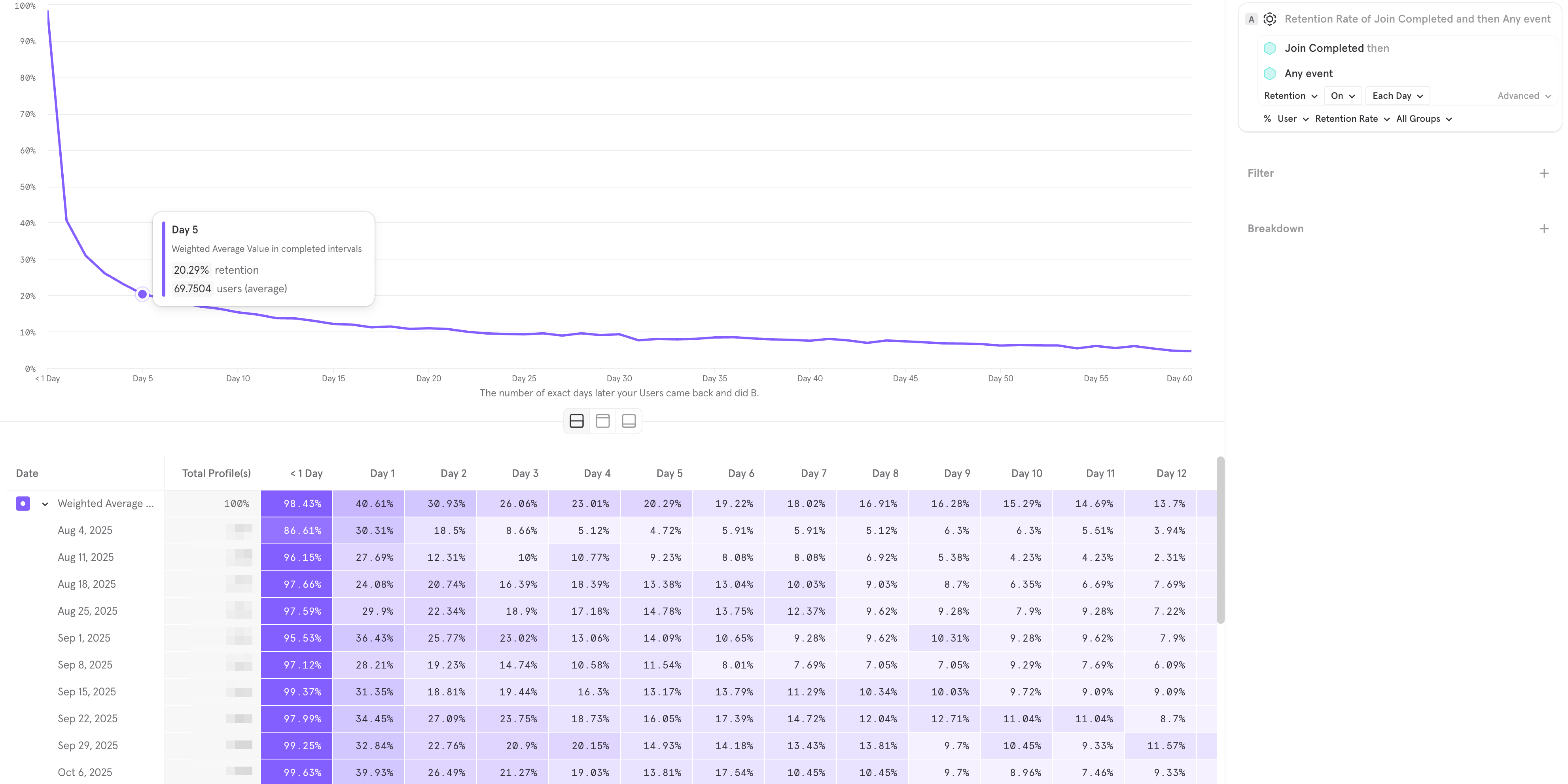
Figure 1: The Linear Retention Report in Mixpanel.
This chart tracks users who performed “Join Completed” and returned to do “Any Event.”
How to Read This Chart (Step-by-Step)
If you are new to analytics, this heatmap can look intimidating. Let’s break it down column by column to understand exactly what you are looking at.
The Left Column: Weekly Cohorts
Look at the list of dates on the far left (Aug 4, Aug 11, etc.). These are your Cohorts. Each row represents a specific group of real people who triggered the “Join Completed” event (registered) during that specific 7-day period. We track them separately so we can see if your product is getting better or worse week over week.
The Columns: Day 1, Day 2...
The columns to the right show what percentage of those specific people came back N days later.
Day 1: This is the most critical column. It shows the percentage of users who registered and then returned the very next day.
Weighted Average: The top row (purple) summarizes the average performance across all the weeks listed below. In this example, the Weighted Average for Day 1 is 40.61%. This means that out of everyone who signed up in this period, roughly 40% opened the app again the next day.
The Curve: The Flattening (Day 30)
Follow the data to the right. In the first few days, the numbers drop fast—this is natural. But look at Day 30. The curve stops crashing. It becomes parallel to the X-axis, stabilizing around 8–10%. This stabilization is what we call “The Flattening.”
The Verdict: Is This Good?
To understand if these numbers are a success or a failure, we need to look at industry benchmarks.
The “Cold Start” Benchmark: For a brand new dating app with zero liquidity (an empty database), Day 1 Retention is usually around 10–15%. Users enter, see nobody, and leave.
The “Mature Product” Benchmark: Established giants with massive user bases and high liquidity often see Day 1 Retention hit 50% or higher.
Conclusion for Figure 1: Based on these benchmarks, the chart above is excellent.
High Liquidity: The Day 1 retention of 40.61% proves that new users are finding immediate value (likely chatting with existing users). The “Empty Room” problem is solved.
Product-Market Fit: Because the curve flattens at Day 30 and does not hit zero, we can confidently say Product-Market Fit has been achieved. We have found a core group of users who stick around.
4.2. Frequency of Use (The Power User Curve)
The Linear Retention report we just looked at tells us if a user came back. But it doesn’t tell us how addicted they are.
You can have high retention but low engagement. For example, a user might open your app once a week just to check if they have notifications, but never actually talk to anyone. We call these users “Zombies.” They look alive in your DAU stats, but they generate zero value.
To spot this, we need the Frequency Report (often called the Power User Curve or L30).
What is this chart? Instead of showing when users return, this chart shows the intensity of their usage over a 30-day window.
X-Axis: The number of days a user performed an action (from 1 to 30).
Y-Axis: The percentage of your user base.
Ideally, you want a “Smile Graph”—high on the left (new users) and high on the right (addicted power users).
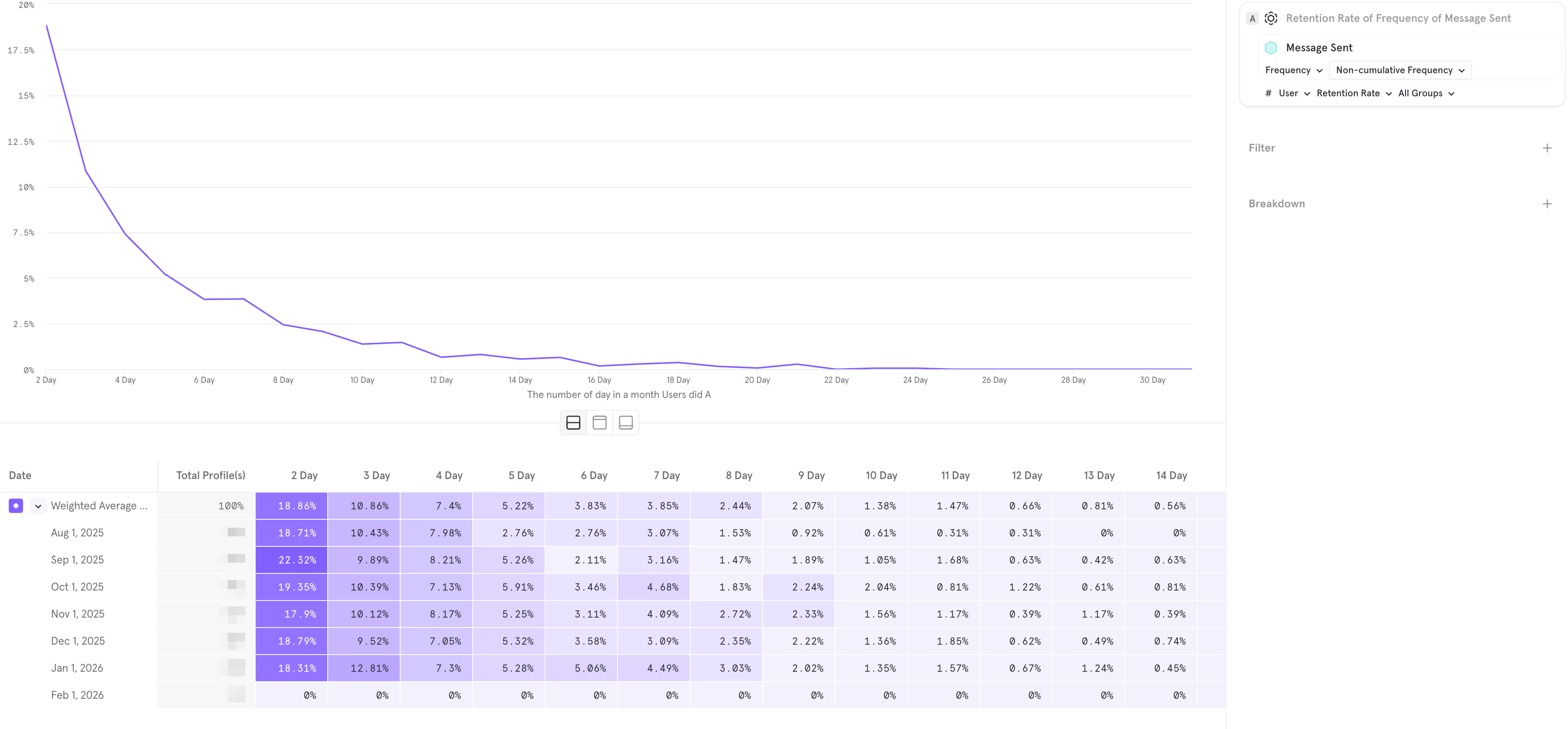
Figure 2: The Frequency Report (L30) for "Message Sent"
Now, let’s analyze the real-world report in Figure 2. This chart tracks the frequency of the “Message Sent” event.
This is a classic example of a product that has retention, but no habit.
The “Tourist” Cliff (Left Side): Look at the start of the curve.
18.86% of users sent messages on 2 days out of the month.
By 4 days, this drops to 7.4%.
This indicates that users are coming in, chatting for a weekend (like tourists), and then losing interest.
The “Power User” Void (Right Side):
Look at the tail of the graph (Days 20–30). The line is flatlining near 0%.
This means almost nobody is chatting daily. You have no core group of addicted users.
The Verdict:
If this were a healthy dating app, you would see an uptick on the right side (the “Smile”).
The fact that this chart dies out completely on the right suggests your Engagement Loops are broken. Users do not feel the psychological need to check their messages every day.
Summary: The “Zombie Product” Trap
Why is it critical to look at both charts?
If you only looked at the Retention Report (Figure 1), you would pop the champagne. You have 40% retention! You have Product-Market Fit! You might think you are ready to scale.
But if you overlay the Frequency Report (Figure 2), you see the grim reality. Yes, users are coming back, but they are not engaging. They are “Zombies”—walking around your app, looking at profiles, but not talking.
The Golden Rule of Analytics:
Linear Retention measures if your product is valid (Do they delete it?).
Frequency measures if your product is monetizable (Do they use it enough to pay?).
You cannot build a billion-dollar business on Retention alone. You need the Flattening in Chart 1 and the Smile in Chart 2. Until you have both, your unit economics will remain under pressure.
Implementation Note: Don’t Code This From Scratch
Setting up these specific events (Join Completed, Message Sent, Subscription Started) incorrectly is the #1 reason founders get bad data.
If you are using SkaDate to launch your product, we have already done this work for you. Our platform has a native integration with Mixpanel. You don’t need to hire developers to map these events—just enable the plugin, and your dashboard will automatically start populating with the exact charts I showed above from Day 1.
Conclusion
In 2026, the unit economics of the dating industry are no longer about finding cheap traffic. That ship has sailed. The game is now entirely about the battle for LTV (Lifetime Value).
Your Formula: Expected Income = (New Buyers x LTV) - Marketing Costs.
Your Lever: Retention, which multiplies LTV.
Your Tool: Engagement Loops (Setup → Aha → Habit) that engineer user behavior.
Your Validation: Cohort Analysis in Mixpanel.
Stop building features based on guesses. Start measuring retention by cohorts and optimizing the user’s path from registration to that first dialogue. That is the only way to make the math work.
Why Build From Scratch?
You are already fighting a war for Retention and LTV. Setting up monetization logic, fighting SMS fraud, and optimizing the onboarding flow is hard enough without having to code the entire platform yourself.
This is why we built SkaDate.
We provide the complete technical engine—native mobile apps, flexible paywalls, and robust anti-spam tools—ready from Day 1.
Ready to skip the development nightmare?
You focus on finding the users; we’ll make sure the technology keeps them there.